Branding project for a health company group with a main focus on facial aesthetics.
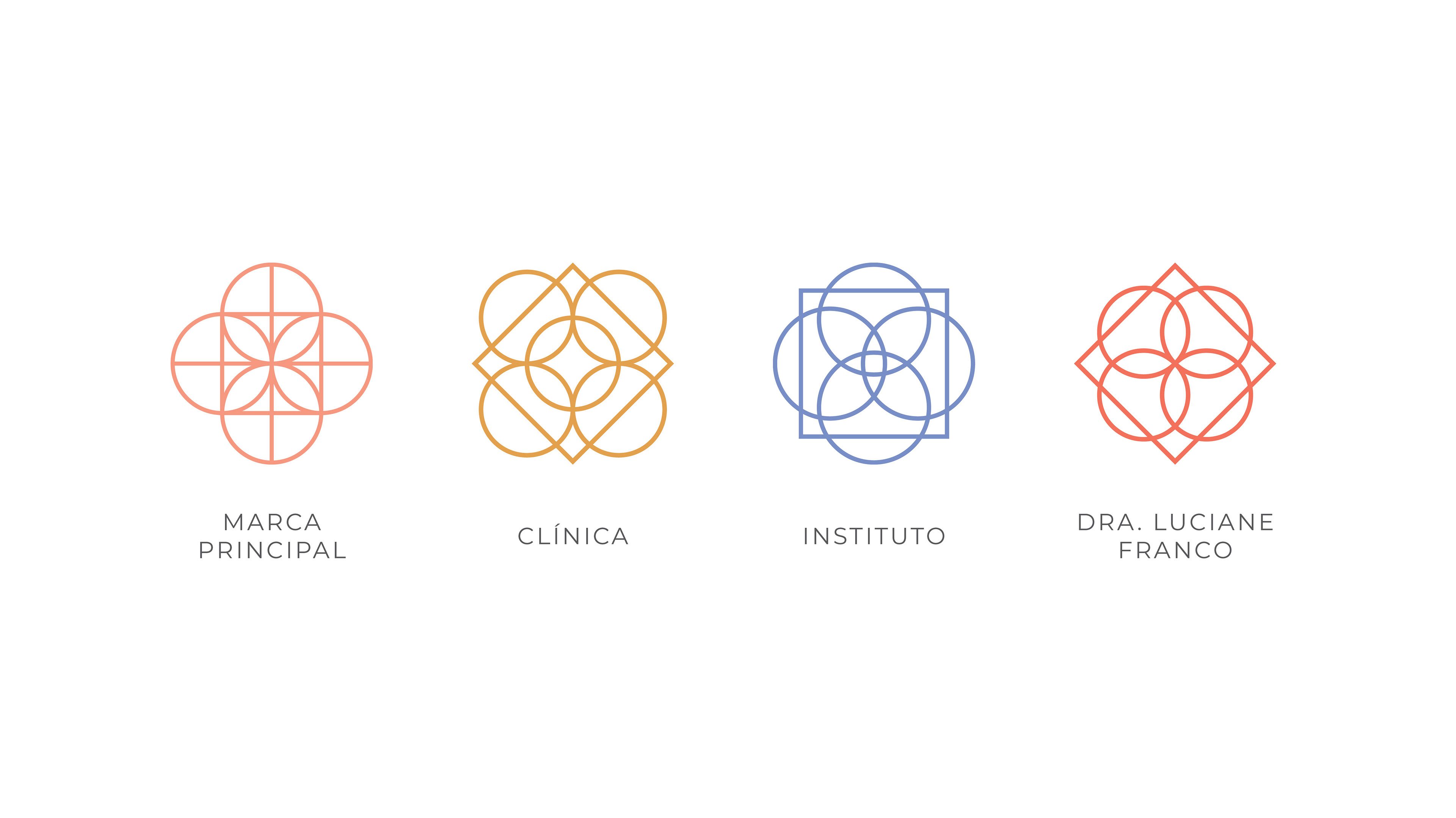
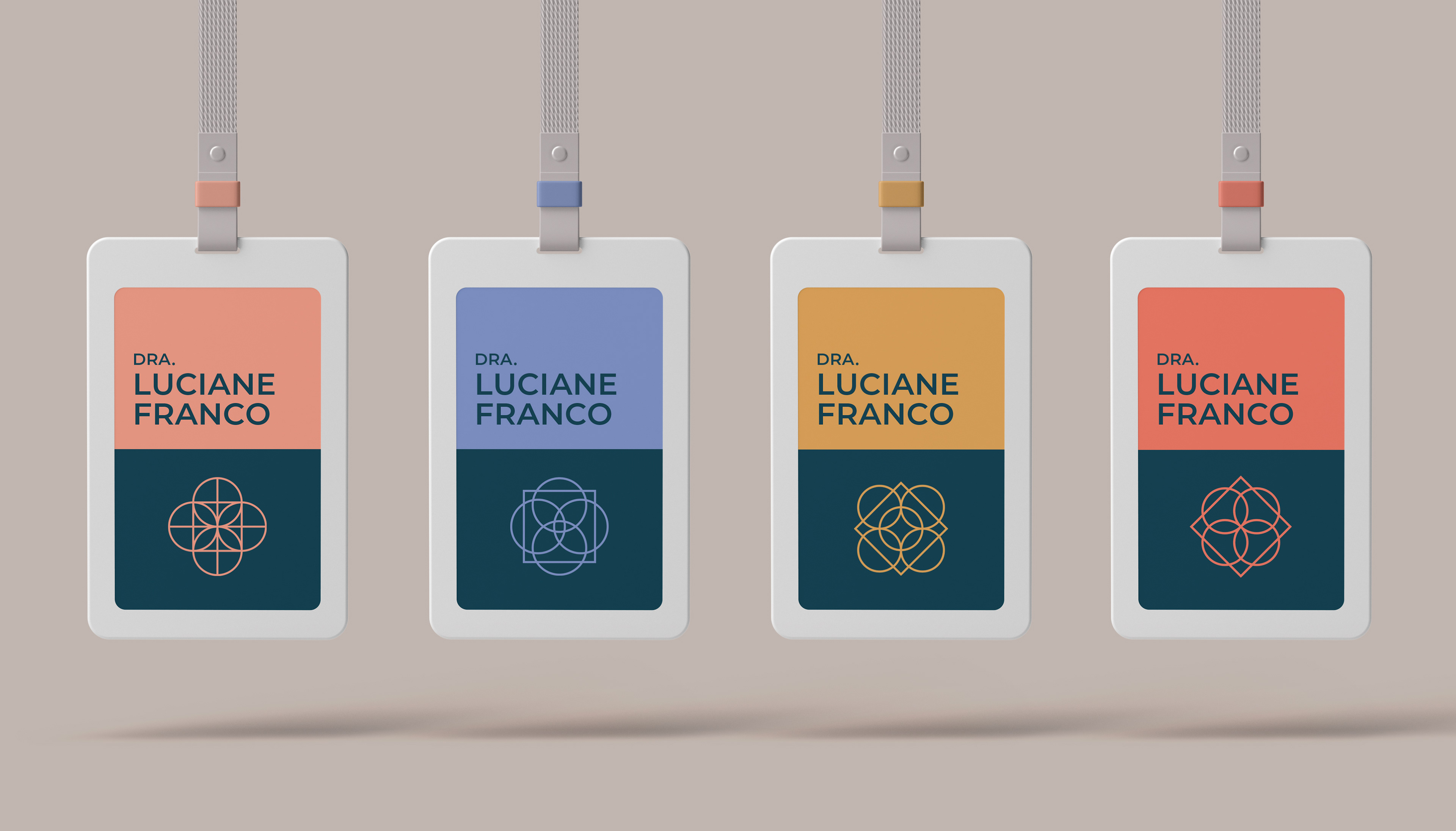
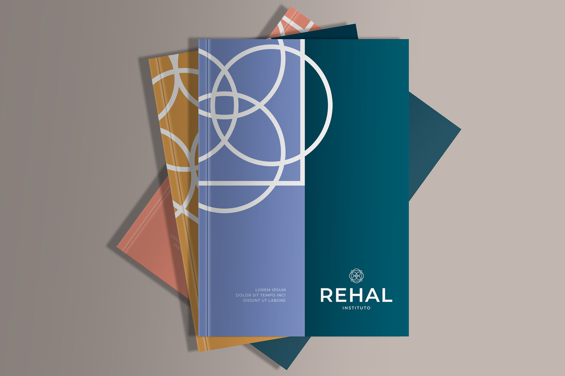
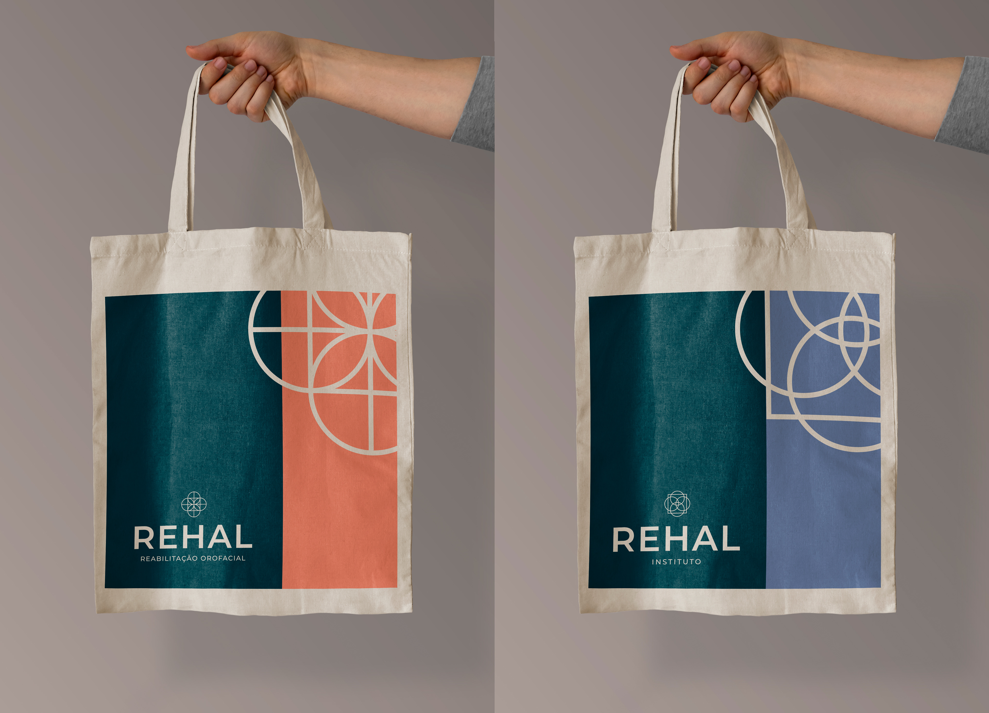
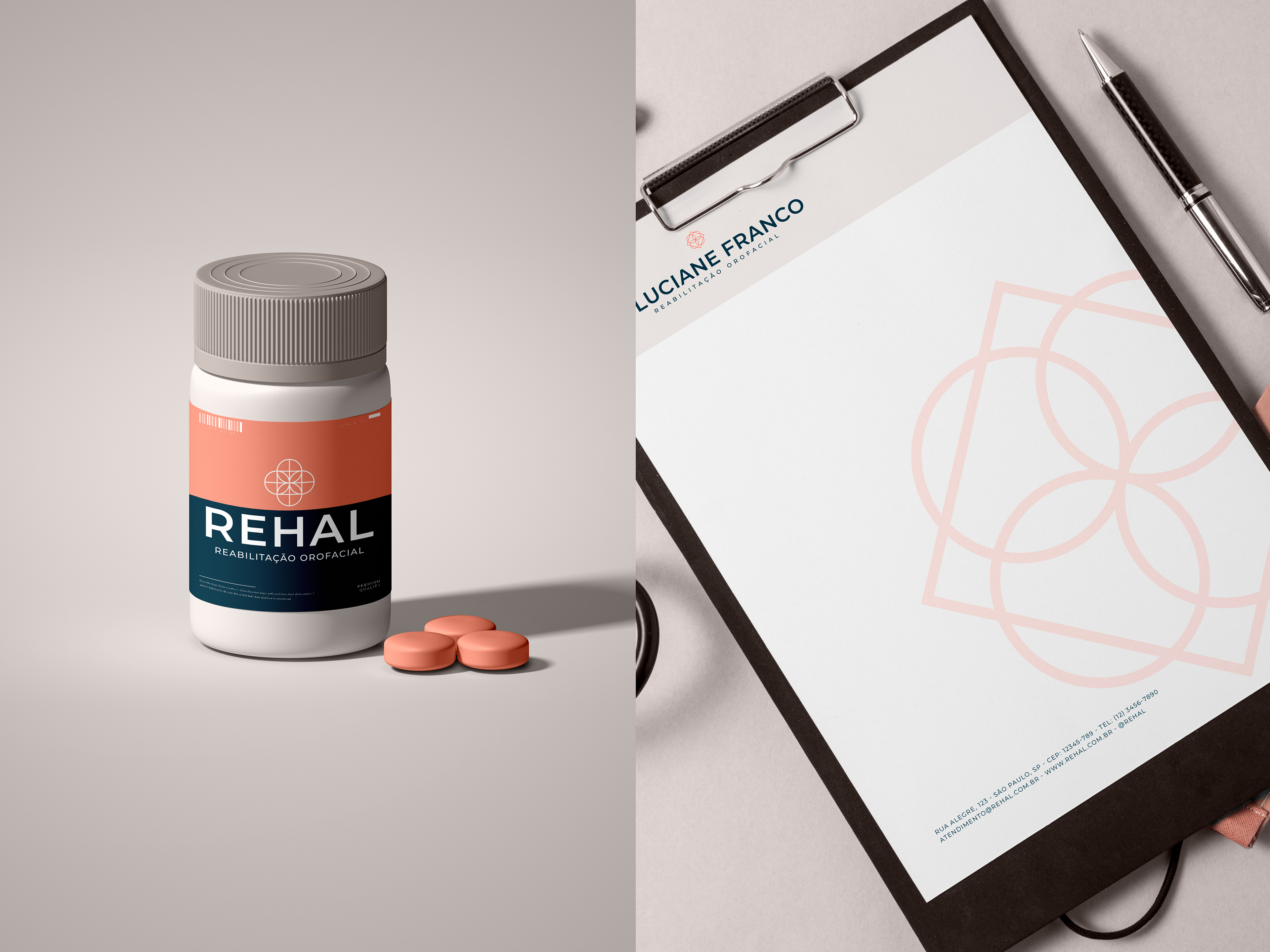
We needed to create a brand that covered the entire business and one for each unit: clinic, institute (with a focus on research) and another for the main professional.
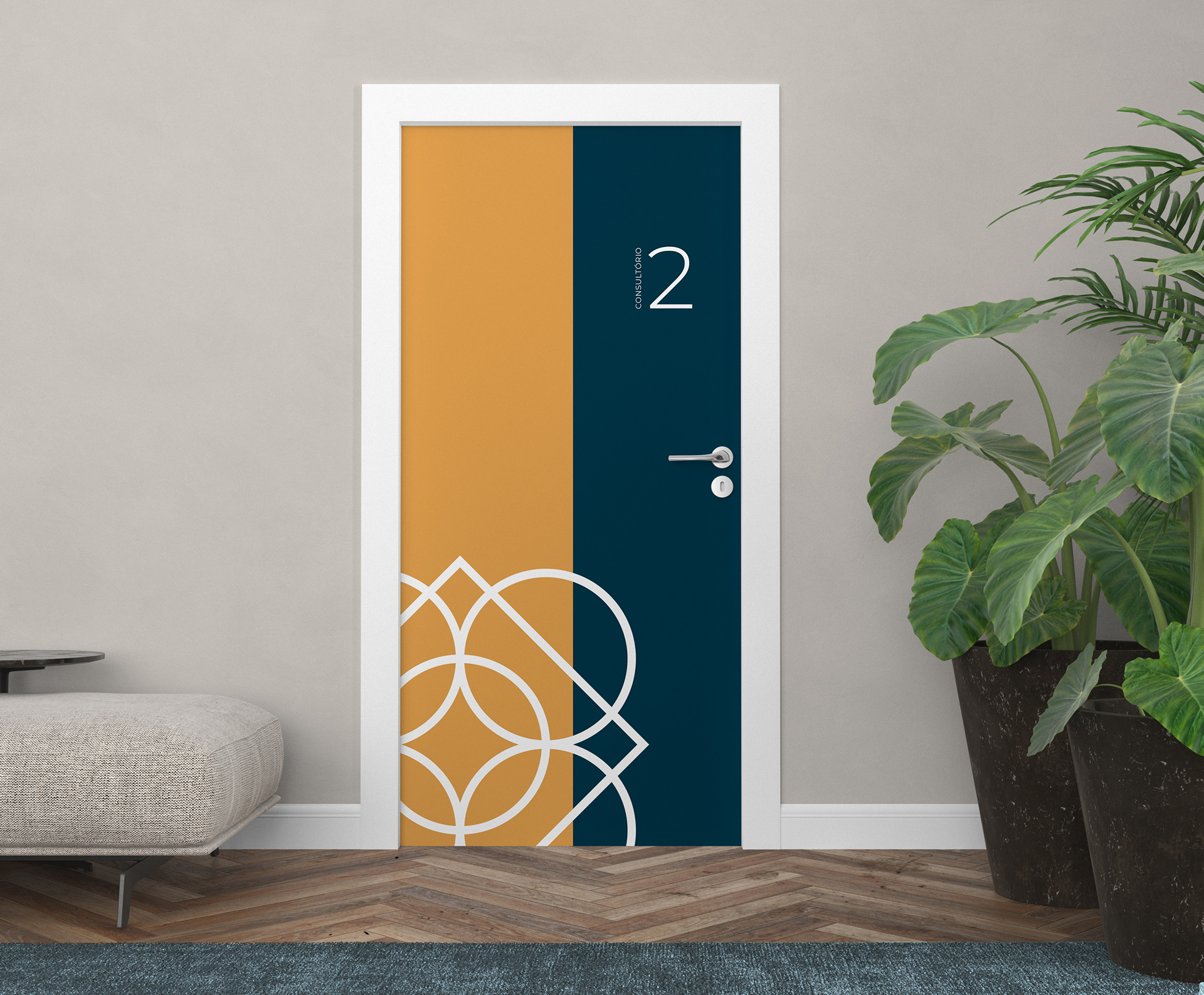
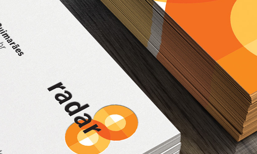
My approach was to use simple geometric elements that, when combined, conveyed harmony and symmetry. Using these simple elements, it was possible to create different icons and colors to differentiate the business units. Meanwhile, the typology and styles ensured a sense of unity and coherence between the brands.